Where is Design Heading?
Part 1 – Where we have come from and what to learn from it


Twelve years after my fellow founders and I sold the design company we founded – Fjord – to Accenture, I left this summer past. It's been a both enjoyable and, at times, painful ride. I’ve been part of the story of digital design in the 30 or so years since the Internet began to intertwine with our lives, and many of us realised that this technology needed to be designed.
We are at another historic moment when a new technology needs to be designed. I am talking about AI. I am talking about you, too. Design is something we all need to think about – now. Why? Because the way we use technology is never without social consequences. It's very hard to think those through, to see them all coming. Design is the process by which we attempt to do so. It aims to put the user at the heart of what is happening. Right now, I don’t think that’s the case. History suggests it usually isn’t.
You may be thinking, yep but I am not a designer. Truth be told, despite what my career signals to date, neither am I – strictly defined. So I am consciously using “design” to mean a very broad scope here. Anyone who plays a role in building and delivering products, services and experiences over digital channels plays a “design” role, even if they do not wield a fistful of Crayola or use Figma.
My friend Shane Ginsberg used to quip that ours was the only industry apart from illegal drugs that talked about the people it was aimed at as users. So for users, substitute humans. And with a massive wave of technology change upon us again, it's time to ensure we consider the human angle.
This is a hugely important journey, as AI begins to impinge on so much of what we do, and how we think.
Before we assess what comes next (yep, AI is looming), let’s pause and ask what can we learn from just over 30 years of digital design so far, which we can apply to the next 30? As you read these, please remember when I say “designer” I probably mean you, whatever your title, if you play any role at all in the delivery of products, services, experiences.
So unsurprisingly, I have been reflecting and thinking ahead and sharing notes with some of the people I have worked with the last three decades. What next for design in an age of AI? Does this matter? Well yes, if like me you think that design is where the human experience of products and services is nurtured, embraced and polished. Yes if you think that users matter.
Even if you only care about commercial metrics this holds true – great design is a differentiator that drives brand and profit.
So I am going to start by looking back and trying to understand what we have learned in the last 30 years. It won’t be a comprehensive history and it will come from a subjective viewpoint, but it is also illuminated by what others have experienced.
I’ll draw on that to suggest what we need to think about next. A trinity of design drivers – Thinking, Doing and Culture – lay the foundations for success. I’ll pull out some constant and emergent features of design in the digital age. I’ll suggest what should be the key foundation stone for design for the next 30 years.
Hint – it’s about how people feel relevant. And its about who gets to design. Probably you.
“The General, speaking one felt with authority, always insisted that, if you bring off adequate preservation of your personal myth, nothing much else in life matters. It is not what happens to people that is significant, but what they think happens to them”
Anthony Powell – Books Do Furnish A Room
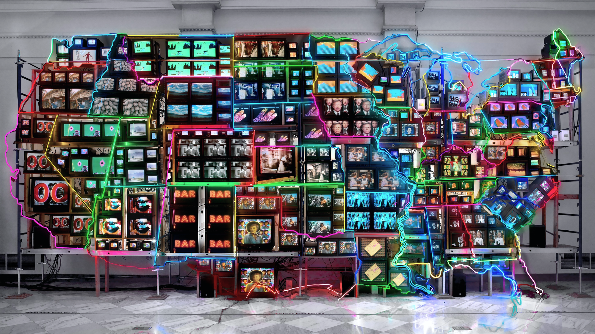
The way we were – 1990s
In 1993 I read an article in the Economist which used the term “Convergence” to describe the coming together of computers, television and what it quaintly called telephony. It predicted seismic things.
I was running a small below the line marketing consultancy at the time that I had founded with a partner. I was immediately transfixed and knew that interactive media was what I wanted to play a part in. Initially the little I grasped was enough for me – this would change marketing forever. Within a couple of years it was clear this would change everything forever.
At the suggestion of an acquaintance, Mike Beeston, we started a new company, initially as a part of the existing agency, to address ourselves to what being “interactive” would mean to brands and marketers. It soon became clear the new company needed to be fully independent of the original, as it needed not only a different mindset and approach to risk, but also a new talent base.
A massive inflection point was meeting designers from a (now legendary) London based collective called antirom. Several of them were about to graduate from a new course at the University of Westminster.
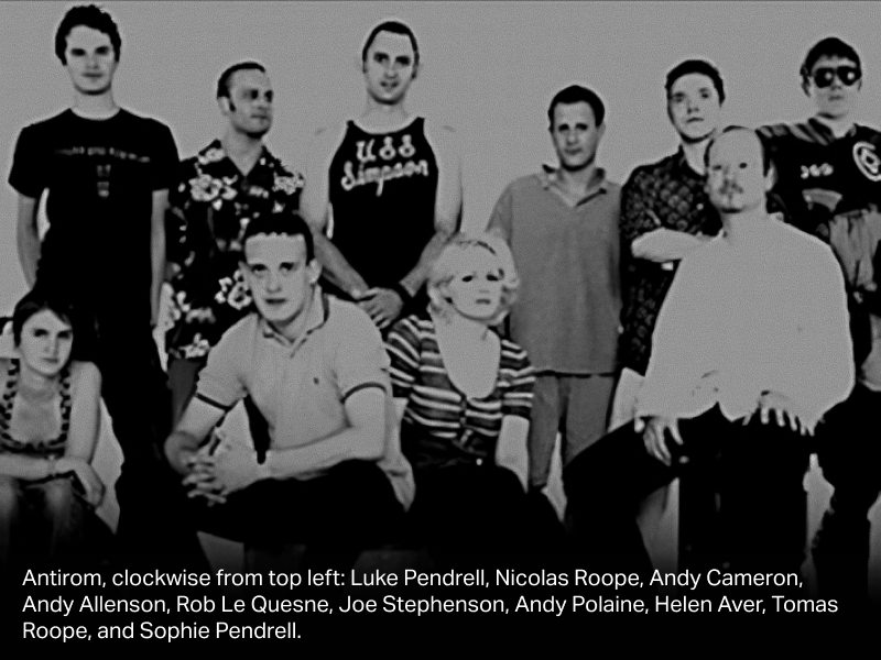
Their work was brilliant, challenging, unlike anything Mike and I had seen before. They had understood that this was a new design medium, with new rules, enabling new concepts. This opened our eyes, and we happily went on to hire and work with several antirom members over the years.
“Until you make the unconscious conscious, it will direct your life and you will call it fate.” Carl Jung.
For a while, everything was experimental. We created the world’s first gay online community — Planet Patrol — using a dial up bulletin board platform marketed by word of mouth and handing out diskettes in gay pubs and clubs. In 1996 in the UK it was the most direct way to get people online. We experimented with pub to pub interactive kiosks around football and dating. We invented and launched Yell for Yellow Pages on the web. We delivered the world’s first live traffic news and route planning over a browser for breakdown insurance organisation the RAC. It was heady times, and we were only just in control.
A huge challenge was team composition. In the mid 1990s it was by no means clear what skills, arranged how, you needed for each project. There were no templates. Together with other early “new media” agencies all over the world – but especially in the US, UK and Nordics – we were creating them.
The challenge was not new. We had to think through how to present information in a structured and delightful way that met both the commercial needs of the “client” and the user, and was feasible (i.e. the technology could support it). That’s been a problem to solve since Sumerian clay tablets. We made some pretty big mistakes on feasibility in the early days, which in retrospect were the inevitable result of ambition, uncertainty and poor technology understanding: look out for this as a theme with AI in the next few years, too.
“Honor thy error as a hidden intention.”
Brian Eno, Oblique Strategies
Of course Visual Design (what things look like) was a core part of what emerged as the suite of design skills that pretty much all projects needed. Rapidly a distinct and separate skill emerged – Information Architecture. How should content be structured so that it was easy to navigate and consistent? That was by no means obvious in the early days. Then gradually Interaction Design became a thing – focused on the transitions between one screen and another, which emphasised the flow of usage and experience – for example the auditory or visual signal that you had completed a task, such as uploading details on a form, successfully. Later on, in effect, Information Architecture and Interaction Design merged (I know there will be practitioners who take issue with this statement).
Interaction Design drew heavily from the physical world and was the discipline that set the rules for how hardware and software worked together. An inspiring example of this was the Nokia Navikey, launched with the classic Nokia 3110 in 1997 and developed by my friend Christian Lindholm. It solved the problem of navigating increasing functionality with one digit and helped the mobile do so much more than replicate traditional fixed line phones. Later (2004) Apple’s iPod clickwheel did the same for navigating thousands of songs with your thumb. A key learning here was that human context – how you hold a device in your hand – massively affects design of interface and the thing itself. They work together.
There were soft skills to consider too, that increasingly were, and still are, a defining arbiter of good vs ok designers, like curiosity – my friend and cofounder of Fjord Olof Schybergson always insists this is the most important quality in a designer – and the ability to work with other team members who will be bringing different mindsets to a project: for instance developers, strategists, project managers.
A new medium always copies the patterns of older media before realising the shape of the new. TV was initially radio with pictures added in; newspapers literally put print editions on the web. A lot of what happened in the 1990s and early 2000s, if you strip away the internet winter of the dot com crash, was the normalisation of all of the above and much more. Gradually standards emerged: where menu bars should go, for example, or how to label different kinds of interaction or task (eg: “log in”, “contact”, “about us”).
Insight: Expect AI to eventually develop a new form: one day not too far away Chat GPT will look as laughably old fashioned as Yahoo in 1996 does now.
After the Gold Rush – the 2000s
There was a bigger design project than web sites in progress, and during the 2000s it became clear that the future was cross platform – that users would engage though a variety of devices (PC, phone, tablet, watch, TV, car, health device, speaker). Of course the phone was the key agent of change – the iPhone especially – but it was not just mobile. Mike Beeston and Olof Schybergson and I had launched Fjord in 2001 while the winds of disappointed dot com hype howled round our ears. The first few years we were frankly a bit lost, overly academic, and constantly seeking a north star that explained what we were doing. Then we got lucky, and early, to understand the coming mobile revolution thanks to a deep relationship with Nokia, who saw what was coming but didn’t, in the end, execute like Apple.
In a long conversation one memorable day in 2007 or so we discussed becoming a mobile only design agency. This had the persuasive charm of clarity and focus, and would have been a good route to go. But Mike – always far sighted – insisted that the future was cross platform and that this was more interesting, though perhaps a tad harder to explain to clients.
We discussed what this looked like. If many experiences were continuing to go digital (they were), then soon we would be designing for users who might be interacting on screens of widely varying size, through not just a keyboard and mouse, but also touch, pinch, swipe, voice, location and more. They would expect their bank, for example, to be consistent across different devices, interfaces and screen sizes. This smelt strongly of complexity – if unsolved a major user barrier, but also hard for companies to resolve in the middle of embracing the underlying technology. This was a design challenge.
“Simplicity is the ultimate sophistication.”
Attributed to Leonardo da Vinci
Two things came out of that conversation. Immediately we agreed that the design mantra (OK, Fjord’s design mantra) for this next era should be Elegant Simplicity. Everything we did had to aim for this goal, both to ease digital experiences for humans and create usage and profit for our clients. What do you leave out? How do you make it beautiful?
The iPhone was critical to this. Not just because of the app economy but also because it introduced a massive constraint: the creative canvas was just so much smaller than a PC screen. Necessity is the mother of (better) interaction.
Reaching back further, Google had already thrown down a challenge of spartan simplicity. The original Google “letterbox” – plus a logo, two buttons, and little else – was almost shocking in its minimalism compared with its directory based peers like Yahoo, AOL. What was happening here? Google put the user's intent above the obvious commercial model (to show ads). It is remarkable that 27 years later they have not veered too much from that formula on their landing page, though telling that over time search results pages have had to become more commercially driven.
Insight: Simplicity is both brave, hard and tough to stick with. The forces of complexity are like a kind of digital entropy, forever adding layers, links and stuff. Complexity is unlikely to go away, and the designer’s job is to simplify it. Commercial models also affects interaction purity.
The mission scales: the future designer must curate simplicity not just in interfaces, but in entire decision systems.
The second outcome from that meeting emerged over the next year or two. We embraced a practice and concept called Service Design. We did not invent it – it’s roots were in European design schools, academia and early innovators like Ideo. But along with others we did commercialise it and translated theory into methods: customer journeys, service blueprints, multi-channel prototyping. Service design sat neatly alongside the other design disciplines – often upstream of them or using their skills to enhance output. A not very hidden advantage of design over other consulting practices is that the work just looks so damned good. That might sound trite, but time and again I’ve seen elegant simplicity create impact purely in the thinking/consulting phase (before end product artefacts are created).
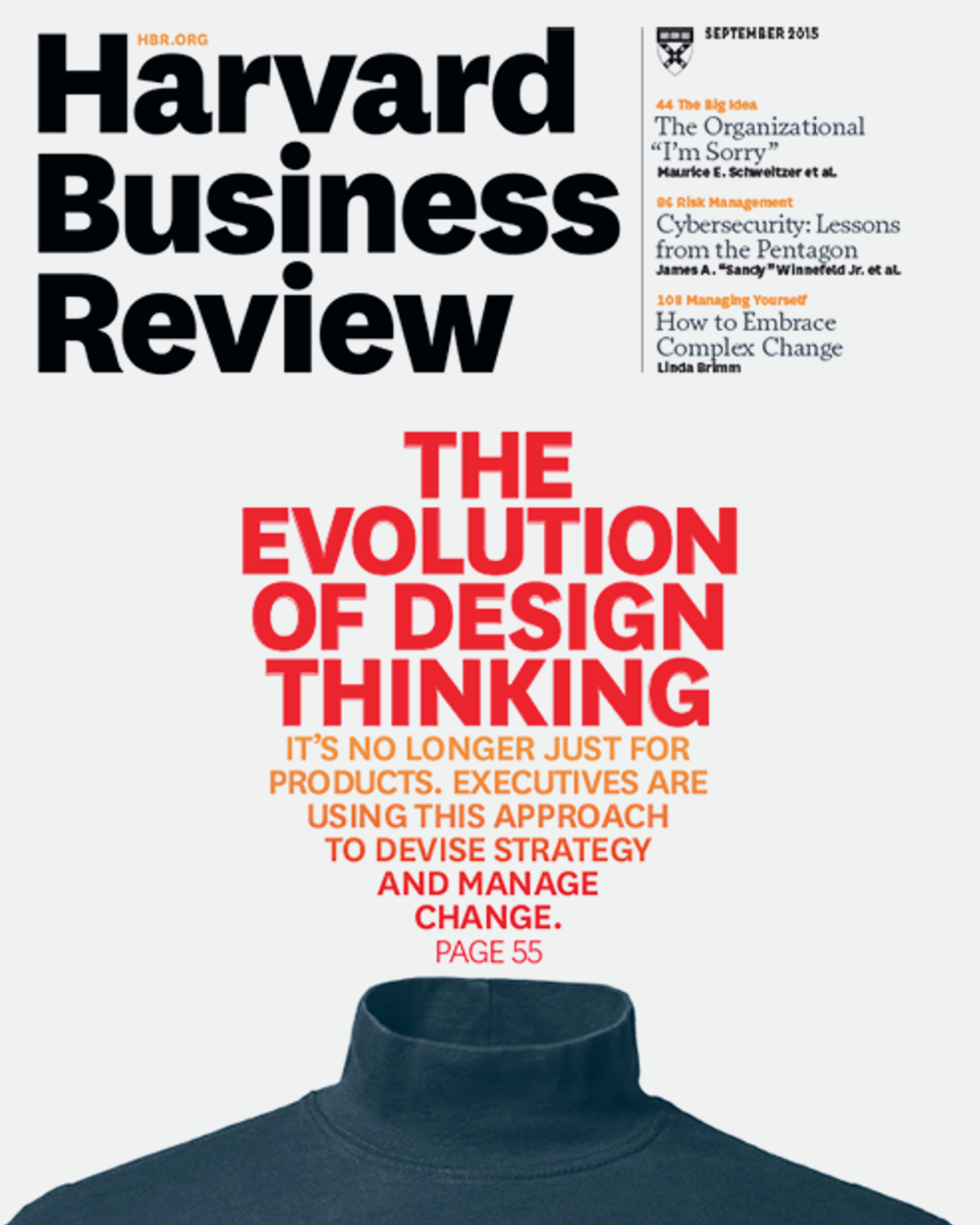
Which brings us to Design Thinking. I knew this HBR cover spelt trouble.
Design Rule of Three – the 2010s
“You either die a hero, or you live long enough to see yourself become the villain.”
Harvey Dent, The Dark Knight (2008)
On the one hand the emergence of “Design Thinking” was a gift to design as a cause and a practice. There is no question in my head that the noise around design thinking supercharged the way Fjord landed in Accenture after the acquisition in 2013. Largely we avoided using the label internally, but that didn’t stop the association sticking. We grew at breakneck speed partly because of this. However there were three obvious problems with the design thinking label.
Firstly it was a very accessible seeming concept. Once a smart exec or consultant grasped the outline, they thought they could do it – and did. Sometimes well, sometimes in an increasingly performative manner – you know, post it note collaboration theatre and lip service paid to end users via invented personas. This accelerated uptake but de-emphasised design excellence.
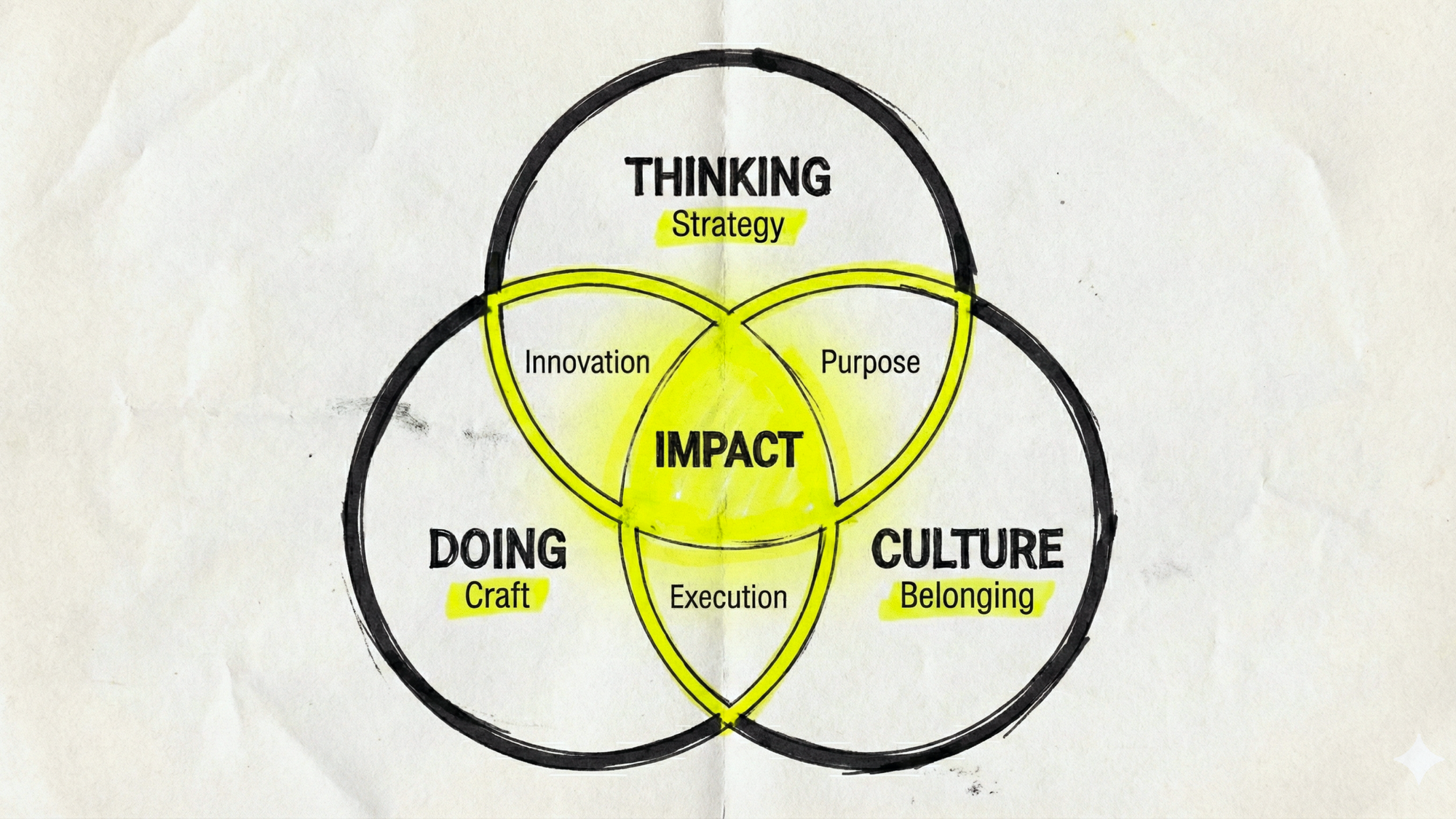
Which in turn meant – the second problem – that often actual design did not get done as a follow up. Defensively, worried about that HBR cover, I coined a phrase at the time – the “Design Rule of Three”. Design Thinking on its own is helpful but to be truly effective you need “design doing”, ie: the actual ability to do service, visual or interaction design. And for longevity and lasting impact you need a “design culture”. This still holds true. If you want to nurture world class design, you must focus on a culture that enables world class designers to do what they do best, to spread and act on the gospel of a human focus. Which in turn creates better (more profitable) experiences.
Culture is a topic I will return to at another time. It’s a hard and soft subject. Hard is about the mechanics of an organisation: for example, how people are incentivised. Soft is how people are led and a creative culture is nurtured. I went to a bank client in London once to see how our embedded team were doing. They were sitting in a rather glum traditional office space. I asked why there were no posters or creative artefacts on the walls – “oh” said our design lead on the ground “the facilities guy won’t let us stick anything on them”. That’s a classic rules based hard issue, preventing soft expression. If you don’t think working environment makes a difference, you may not grasp how important that last point is.
Culture cannot easily be faked either. I’ve seen a lot of innovation centres signposted inside corporate buildings with fake chalk writing and pretend doodles on blackboards to signal informality! and creativity! Usually it’s a kind of corporate botox.
The third problem – which I predicted as soon as I saw that 2015 HBR cover – was the inevitability that Design Thinking would be hyped up as the latest management fad (think 360-degree feedback, business process reengineering, empowerment, management by objectives (MBO), matrix management, holacracy and lean startup) then eventually someone would say that it does not work, and produce research to prove it. Which is exactly what happened.
Check what FastCo and Technology Review have both recently opined. They think it's so over.
https://www.technologyreview.com/2023/02/09/1067821/design-thinking-retrospective-what-went-wrong/
I don’t personally think Design Thinking has gone away. But it makes a good headline in journals and disposable Medium pieces. Rather, I see it now very embedded in the way many teams work across businesses, even if its not called out specifically so much.
Insight: there is a recurring pattern at play here experimentation → codification → diffusion → dilution
Each wave of design maturity (web/IA → service design → design thinking → business design → EX) follows this arc. The next era – underway already - will start messy and exploratory all over again but will end up with new systems defined.
Which is the point at which design risks losing its spark. I’ve argued for a few years now through my Trends work that design was getting tramlined by a combination of platform rules, the need to design for discovery by search and commoditisation. Guard against codification killing originality; design must institutionalise curiosity, not static methods.
Regardless of the rise and (current) fall of Design Thinking, but intertwined with it, other ideas and practices emerged out of experimentation in the last 10 years that build towards our picture of where we are now.
Business Design
In business there is always a tussle over who owns the higher ground. Its not just friction – this can dictate who gets to decide and shape what happens next, and it tends to attract a premium (i.e. its better paid).
Everyone wants to be at the upstream table. Way back in the days of Razorfish, and doubtless other 1990s web agencies, each skill grouping demanded they needed to be there when projects were defined and scoped. I remember we reached a stage where this ballooned pitch teams to double or treble the number of people they needed to be, as even audio designers (sorry if that was you) claimed a seat. Understandably, clients remonstrated when we turned up mob handed to sell, or staffed projects with multiple specialisms.
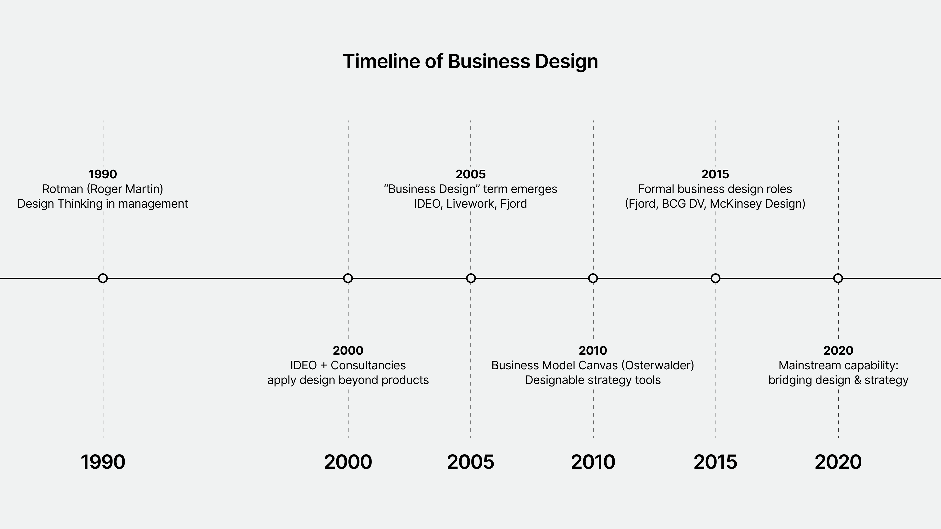
Business Design was two things in my view. From a parochial perspective it was a rational and partly defensive attempt by the design industry to swim upstream towards strategy, as reflected in the chart above (created by Chat GPT). This happened at the time that strategists began to espouse “design thinking” and white water raft downstream.
However from a practical, not political perspective – it was more substantive. Business design focused on “viability.” Designers have always thought about “desirability” (will anyone want it?) and “feasibility” (can we make this? will it work?) but often been less disciplined at addressing the issue of: will this make money? This is viability – for a business or organisation, the question of: is this worth doing? Keep in mind this holy trinity of desirability, feasibility and viability. It’s a very useful framing and key to what comes next in design.
In essence Business Design used design tools and, yes, design thinking, to embed a more user/human centred approach at the start of the strategic process. A failing of much strategic thinking is that it overly focusses on viability without enough consideration of desirability and feasibility. In other words, it risks veering too theoretical. Business design both brings the human angle to the forefront but also forces design to consider the business practicalities – like profit or supply chain realities. At Fjord we began the journey in London championed most especially by John Oswald and later, Alex Jones. These were not designers as we had previously defined them but thinkers who framed the work design would then do.
The label is now (in 2025) less common, but the idea has become more embedded. The business design mindset — experimentation with business models, user validation before scaling, marrying user insights with funding plans has become a norm in corporate venture and innovation studios and labs, and in small and growing firms where you must prototype both the product and the business model. It is also visible in business schools and executive education.
Employee Experience
At about the same time (late 2010s) the thinking behind a focus on user experience (UX) came to bear on a distinct set of users and issues: employees.
Gradually there was a realisation in many organisations that UX and employee experience (EX) were two sides of the same coin. If we believe in orchestrating tools around the user, surely the same thinking should apply to employees, and the tools they use. Even more, for many organisations the employees actually deliver part of the UX: think retail, call centres, govt workers who are public facing, hospitality, transport. That air steward who greets you by name has a system to help them do so. That electricity supplier you have a beef with over your bill can stand or fall on how they deal with you – that’s not just a data problem (what we might know about this customer) its also an interaction challenge (how we take decisions and treat you).
What was obvious to many workers was that the tools they used at work were a pretty poor experience compared with what they used in their private life. Uber’s design made those workers’ travel booking system look very shoddy. The simplicity and ease of use of say, their exercise app, was not matched by their company corporate timesheet and expenses tool.
“Work is love made visible.”
- Kahlil Gibran, The Prophet
At Fjord, and I don’t doubt elsewhere, we saw a huge rise in requests from our clients to design their EX. However, this was not just an exercise in retooling interfaces. It spoke to culture too. That question – why can’t we have well designed software? – went beyond, to why can’t we have a different culture too? Outside Silicon Valley everyone had heard the stories of fabulous free meals, hipster coffee and proliferating creches at the workplace. Google was usually held up as the exemplar. Quite probably the reality at most tech firms belied the stories, but received wisdom was that a new era of work culture had dawned.
Insight: Design’s borders always blur
The story shows design repeatedly encroaching into strategy, culture, business, marketing. Where is the next encroachment? Can we expect the designer to act as custodian of human consequence around AI?
The Ethical Challenge
At Fjord a major part of my role was to lead our annual Trends report (these days Accenture Life Trends). This began with Christian Lindholm (ex Nokia, had come to work with us – see Navikey above) in 2008. I took over curating it in 2012. Over the twenty teens I gradually saw an emergent and noisy signal in what our design studios were bringing to us as trends to note each year. We ran a massive exercise over 35+ cities across the world.
More and more frequently, they were nagging away at ethical issues. The Fjord Trends remit was the intersection of humans and tech and business. When Christian initiated it, we were largely driven by seismic annual changes in device and software capability, and there was more than enough to comment on. But our designers were starting to ask questions about the ethics of what happening.
I think there were several sources for this. One was a growing consciousness of the power of the wrong kind of design intent. UX specialist Harry Brignull coined the term "Dark Patterns" in 2010 to describe manipulative, deceptive design choices that optimized commercial metrics at the expense of the user. As so often, naming something brings it out into the open. The community of designers not only began to audit their work for this, but to think about and debate the human impact of their work. Fjord’s 2017 Trend “Unintended Consequences” zeroed in on this (a little late I now realise).
Growing unease about a number of factors played a part, amongst which were the direction that the social media business model was taking, the issue of who should control user data, and the degree to which daily life was being overwhelmed by digital intrusion. We’d not really had much time for this in the 20 previous years, swept up as we were by the excitement of all the new technology, sometimes extending to a cyber-utopian view of the future. Additionally, the pace of obvious new technology innovation slowed down somewhat in the late twenty teens, which gave us time to breathe, observe.
In addition, broader social trends affected designers as much as anyone. The rise of the Diversity, Equity and Inclusion (DEI) agenda added a broader societal impetus to a rethink of work place and culture. Often this was part of a growing belief that companies should have “Purpose” beyond profit for shareholders. A key driver of Purpose was also Sustainability – catalysed for most by the UN’s 2015 published Sustainable Development Goals (SDGs). This made explicit that how things are made and consumed was a core design issue, if you cared to think about it.
And most designers did. I personally have a lot to say about Sustainability another time. For now its enough to observe it has taken a backward step in the agenda, alongside “Purpose”, but over time I believe it will prove to be a – maybe the – key objective.
So why did designers become so motivated by these issues? I think there were two reasons. First, as a skill set they naturally lean liberal in their political affiliations. That’s a sweeping statement I cannot easily prove – it is based on working with literally thousands of them in the last 30 years, reading and hearing their thoughts. Second, and more important, design places human needs and behaviour at the centre of the thinking process and intentionally changes how things work around with those in mind. It’s then a natural leap from thinking about the user as individual, to user as part of a society, when we see the unintended human results of tech driven change.
I’ve heard a few designers claim they alone hold this torch. That is myopic. Most people in business and organisations care a great deal about human outcomes, but may not be incentivised to do so. Metrics matter. Nor can we delude ourselves that one specific skill set can change everything for the better. However the range of practices developed in the last 30 years that I have described, have had a major influence on the direction of technology and have gradually gone mainstream and become embedded in the process.
Insight – Technology change outpaces our ability to realise its consequences but there is always a re-balancing. This gives us a strong signal for where “design” goes next, in the age of AI. Its also not just about people with “design” in their title.
Design from Within
The biggest signal that design was now being taken very seriously by all sorts of organisations who might have ignored it previously was the growth of what we coined “Design From Within”.
Gradually all sorts of organisations began to build design teams, initially using external consultancies to staff and lead these. I can think of a Spanish bank, a UK retailer, a German insurance company, and an oil and gas industry major who used Fjord for this all in the space of two years or so. Its important to pay credit to Steve Jobs here as a role model. Not just because of what he achieved at Apple but because he became the most lauded business person in the world, and he noisily championed design. If you wanted to emulate Jobs (and many execs did), you had to enable design.
Government, most notably in the UK where the Government Digital Service (GDS) pioneered the simplification of govt, were early to it too, starting in 2011.

Gradually some of these teams both became very large and, unsurprisingly, took some work from external consulting designers. We saw talented Fjordians leave to work for clients. Much of the work these teams did was more EX than CX in nature. I am in no doubt that it did play a role in embedding design in places where it had previously been at best, an afterthought.
Design had arrived. We even saw the rise of Chief Design Officers, sitting in the C-suite, where we always thought it should have been. Not just upstream, but at the source.
Insight: Everything leaks Nothing stays in its boundaries – digital is a leaky bucket by its nature. Web sites got scraped, apis formalised the exchange of data, social hyper-accelerated distribution, now AI appears to be one big alphabet soup.
Expect design from within to becomes design from between. After internal design teams came of age, the next leap is inter-organisational design – public/private ecosystems, data collaboratives, climate alliances. Designers must orchestrate across porous boundaries.
Understanding Users
I have said nothing until this point on Design and Ethnographic Research. Truth is the role of research has on-going pain point for years now. It’s all very well talking about the centrality of users, but unless you make an effort to get out and understand them it's lip service. Shelley Evenson and Martha Cotton introduced me to the concept of “big data” and “thick data” and “broad data”. Big data is quantifiable, seen in surveys or metrics. Broad data is contextual trends (this essay is a kind of broad data). Thick data is depth of understanding based on observing or talking to real humans.
It is extremely powerful at delivering insights that matter to the way products and services are delivered. I remember one retailer we helped to see that buying light bulbs is difficult because of the sheer variety of specs – everyone has a drawer in their kitchen with the wrong lightbulbs they bought – which led us to easy digital solutions to solve a very human problem around wasted purchase. The insight came from a floorwalker. Big data would never have shown that.
For another supermarket retailer observing customers examining their bills in detail as they wheeled their trolley away helped us understand that at a deep level trust was lacking (did I get that two for one offer redeemed?). Perhaps reimagining the receipt could have helped with this. Why have receipts not been redesigned in the physical world as Uber did so well digitally?
The issue with this kind of research is threefold:
- It's frequently the first thing to go if costs get cut and most people find it hard to defend
- Organisations think they know it all already or invent personas on the spot and rely on those
- It takes time (though not that much in reality)
In an age when the mantra is that data is gold (I agree with Ben Evans on this that a lot of data is sand) it's easy to believe that big data tells you all you need to know. But it doesn’t. When I ran a consumer facing startup we had hundreds of thousands of daily users; I could see the data every morning on what they were doing. But if I wanted to know why the data looked like it did, it was quicker and better to ask the customer service team about what they were hearing live and direct from users.
In the age of AI we cannot afford to let go of this thick data research skillset. Already many organisations are falling for the myth that “synthetic” data – basically made up human beings – can deliver insights at scale and speed. Perhaps it can simulate it. Over time, we will find that there is no substitute for truly madly deeply getting out there. Because:
Insight: Feeling becomes the new functionality
As I said earlier “the key foundation stone … is about how people feel.” As digital experiences saturate every domain, affective design - trust, calm, confidence, belonging - becomes a differentiator. AI will make services competent; feeling right will make them relevant.
After the deluge – the 2020s
And yet….the inflated expectations that we optimistically held for design back in 2020 have not been met by what has happened subsequently. Or perhaps not positioned design in the leading heroic role we imagined.
The pandemic and its aftermath played a key role here. Obviously Covid disrupted everything for a while, and subsequently where and how work happens. But its aftermath also has not been a period of stability, especially in 2022/2023 – an era Accenture Trends in 2023 called out as the “Permacrisis” – with inflation, supply chain issues, war, severe weather issues and covid lockdowns still looming and undermining consumer and business confidence.
With growth hard to find, we saw a massive swing to an efficiency agenda in almost every organisation. For a brief moment pre-Covid, we had fantasised that Chief Design Officers would become a regular fixture on exec teams. This dream flickered into life, then went out. I’m not saying they no longer exist. They do, but its not a standard role at C level.
From 2022–24, design layoffs and reorganisations shrank some standalone C-suite seats and pushed design under Product or Tech. That spooked a lot of leaders, press and designers themselves. But design has not gone away. I’d argue instead it is embedded pretty deeply.
Design leadership titles, which matter as a signal, are fragmenting across a mix of words: design, experience, product. Design reports into different places depending on the company’s operating model. That can be a mixed blessing, but except in rare circumstances (Mauro Porcini at ex Pepsi, now Samsung), it does not report to the CEO.
Expectations are tougher, which reflects the tone of the times we live in. Leaders are judged on de-risking decisions, metric driven outcomes, and orchestration across product, data, and AI, not just craft or aesthetics. After the layoffs, boards expect clear business cases for headcount and the scope of design.
So what next?
The trinity remains — but the weight shifts
The “Design Rule of Three” (Thinking, Doing, Culture) remains valid, but the centres of gravity will probably move:
- Thinking → less about post-it ideation, more about systems, ethics, and emergent intelligence.
- Doing → blends human and machine creativity; AI becomes a design material.
- Culture → moves from craft communities to ecosystem stewardship: how humans, algorithms, and organisations co-design responsibly – but balanced by a focus on authentically human as a (maybe the) source of differentiation.
Above this, I believe Relevance is the key idea for what happens next and the role we all have to play in designing our world over the next 30 years. At worst, AI may well be an engine for human irrelevance. This is much discussed, and we can’t know it for sure, but left unchecked, the trend lines are heading that way. Brands and organisations of all stripes talk a lot about being relevant to their users. Let’s turn that lens round: how do we make people themselves feel relevant? Might that be the most powerful way to connect? Who should take the lead on that?
Mark Curtis
Stand by for Part 2, arriving next Full Moon — Who Designs the Future When Everyone Can?
Read Next

The Full Moon Podcast
Episode 4 — Being Relevant


Being Relevant
Designing for Human Relevance

Creatures and Machines
An all-encompassing clash is coming
Comments